Wout Neirynck

¿?

Wout Neirynck

Graphic Design & Typography
Currently active in Brussels and Leuven. Contact me in Dutch, French or English. Let's get coffee.

— Education

BA - Visual Arts, Graphic Design (LUCA School Of Arts, 2015)
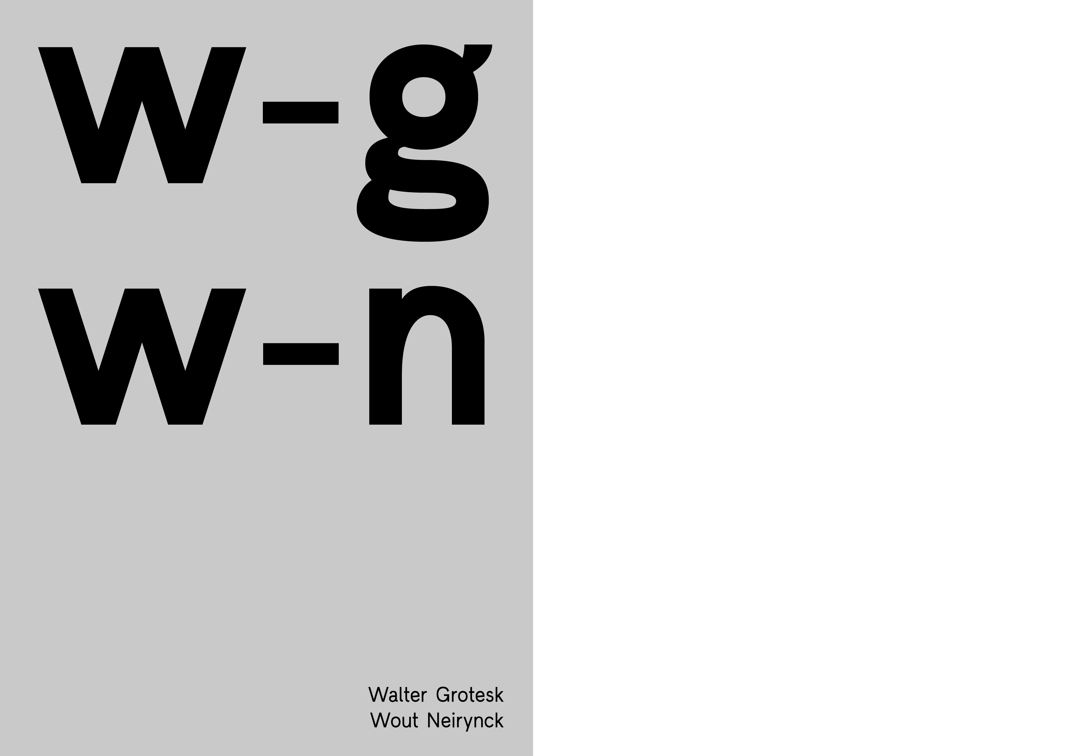
MA - Typography (ENSAV La Cambre, 2017)

— Experience

Intern at LAb[au] (2015)
Collaborator at P&A (2017)
Intern & Assistant at ROMA Publications (2017)
Freelance Graphic Designer at KPOT (2017)
Graphic Designer at KPOT (2018 - current)

— Other

Workshop and exhibition with StudioSpass and Large (2016)
Contributor for Harrison mag (2017)


mail@woutneirynck.be
Linkedin

Walter Grotesk

This font is called Walter Grotesk. I think it sounds quite good; Walter Grotesk. My first name is Wout, which is historically derived from Walter. I like the name Walter, it's quite an older name, from my parent's generation. But it still has a cheerful sound to it. It's like an alter-ego for myself in less-serious business than the usual (whatever that may be). The name also has some history to it, from Walter Gropius to Walter Van Beirendonck. The creation of Walter Grotesk started when I got sort of blocked in other projects. Projects for school that where quite heavy and needed some deep focus that I couldn't bring up at that point. I needed to do some creative work that was more freely and less heavy. Less-serious business. So I just started to draw some characters. The goals weren't that big; I wanted to create a joyful sans-serif font that was suiting for text as well as some bigger corps. Less-serious business.

Request a license at TIP Foundry.